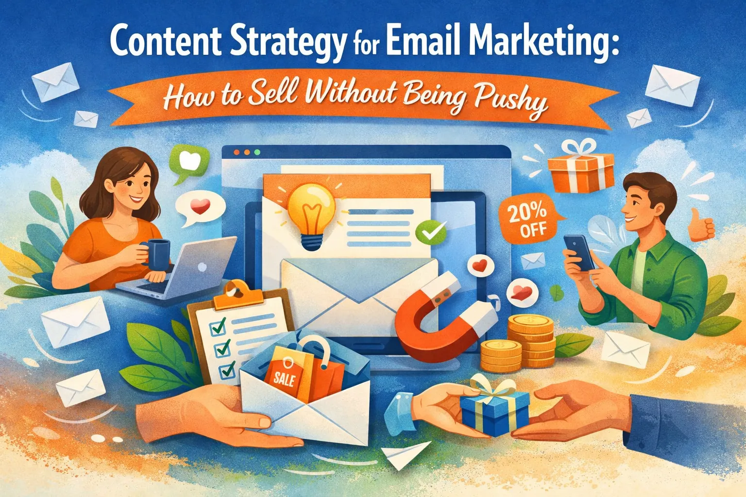

Each newsletter needs one clear purpose. The most common goals are to educate users, convert them to the next step, keep them active or bring them back after a long pause. One secondary goal is fine if it naturally supports the main one. Anything more starts to blur the message.
Goals tie directly to audience segments. A new user needs guidance, not pressure to upgrade. An active customer expects tips and improvements that make their current plan feel even more useful.
Content pillars
Content pillars are the themes you return to every time you plan a newsletter. They give structure and save time because you don’t have to reinvent the concept of each email from scratch. Most teams work with a simple set:
- educate
- demonstrate
- show social proof
- make an offer
These pillars cover the common ways a business can help a reader understand the product and move closer to action.
Choose three to four pillars that match your stage and audience.
Microcopy & UX
Clear writing inside an email shapes how people move through it. The button copy carries the most weight. Short action verbs work best because the reader understands what will happen next.
Phrases like “Start trial,” “Book a call,” or “Download guide” push the action forward. Long labels slow the eye and make the button feel heavy, so the tighter the wording, the better. A good test is whether the button still makes sense when read out of context. If it doesn’t, the wording is too vague.
Links and buttons serve different roles:
— A button is for the main action.
— A link is for a secondary step that helps the reader explore without pressure.
In a product onboarding email, a button might drive the user to set up the core feature. A text link placed lower in the email can lead to optional documentation. This balance gives the reader freedom without diluting the main path.
The structure of the email should guide the eye in a clean, predictable way:
- A headline sets the context.
- A short supporting line gives clarity.
- The call to action stands out without visual noise.
- White space helps as well because it separates blocks and lets the reader scan instead of parsing a dense wall of text.
- Modular blocks work well: one idea per block, enough space to breathe and no clutter. Images should carry meaning, not decoration.
- A screenshot that shows how a feature works helps the reader act faster. Random stock image only distracts. Alt text is mandatory because some readers view emails with images off.
Responsive design and accessibility
— Phone first
A single-column layout prevents awkward side-scrolling and makes the message feel easier to follow. Short lines help the eye move quickly. The main button needs enough tappable area so the reader doesn’t have to zoom or aim carefully. A tight layout on desktop turns into a frustrating experience on mobile. A mobile-first check helps you spot these flaws early.
— Accessibility
Clear HTML structure allows assistive tools to read the email in the right order. Readable font sizes help every user, not only those with vision problems. Strong color contrast ensures that the text is visible on bright screens. Alt attributes on images explain what the user is supposed to see. A logical reading order prevents screen readers from jumping around. Keyboard navigation should work smoothly, especially for interactive elements like buttons and links. When the markup is simple and consistent, accessibility comes naturally.
Visual templates and modular blocks
A simple, repeatable page for every email keeps work fast and the experience familiar for readers. Modular blocks speed production because you assemble emails like building with tiles. Designers create a few block types once. Writers drop content into the same slots.
This keeps spacing, button sizes, and reading order consistent across campaigns. When everyone uses the same blocks, testing and measurement get simpler — you compare the same layout with different copy, not a new design every time.
Use these practical block specs as a rule of thumb:
- Headline. 30–50 characters: keep it tight so it reads on small screens.
- Supporting line. 60–90 characters—one sentence that clarifies the headline.
- Body paragraph per block. 100–180 characters—short lines scan better on phones.
- Button label. 2–4 words.
- Image ratio. Use images sized for a 600px email width, common ratios work well: 16:9 for hero screenshots, 4:3 for product photos. Always optimize file size so loads are fast.
- CTA placement. Place the primary button near the top of the hero or within the first content block.
Copywriting that sells
Write as if you’re helping someone decide, not hustling for a sale. The tone should be helpful, direct, and specific. Use plain verbs and clear outcomes in every sentence. Avoid hype words and blanket promises. Instead of saying “game-changing,” describe the result: “Saves 30 minutes on weekly reporting.” That feels concrete and useful.
Three non-pushy selling formulas as building blocks:
Educate → Demonstrate → Ask
Teach a short idea, show how the product applies, then invite one clear action. For example, explain a quick tip, show a screenshot of the tip in use, then add “Try this step in your account.”
Problem → Solution → Proof
Name a real problem, explain the specific fix, then add a short proof point such as a user quote or metric. For instance, “Reporting takes too long. Export templates cut the time to five minutes. Teams reported 40% faster close-outs.”
Insight → Benefit → Trial
Offer a useful observation, state the direct benefit, and finish with a low-risk trial or demo. For example, “Most users miss this setting; enabling it increases click rates. Enable it in one click — test for free.”
Subject-line and preheader formulas
Subject lines decide whether your email gets a chance. Pick an angle—curiosity, clarity, benefit, urgency (value-first), or personalization—and write to that single angle. Pair every subject with a preheader that completes the promise.
Preheader pairing tips: keep the preheader as a clear next step or small detail that backs the subject:
— If the subject is a claim, the preheader should show how the claim is plausible (“See one setting we changed”).
— If the subject is personalized, the preheader should tell what you want them to do next (“Open your account to try the tip”).
A/B test ideas for subject lines:
- test a clear benefit against curiosity
- test personalization vs. generic
- test short vs. slightly longer preheaders
Personalization and segmentation
Personalization is useful when it helps the reader feel the message is relevant. Keep personalization pragmatic: use first name, recent actions, or the product line they use
Segmentation gives each email a more useful audience. Start with a few practical segments:
- trial users who just signed up
- active users who use key features
- high-intent prospects who visited pricing or requested a demo
- dormant customers who haven’t logged in for a period
For trial users, send short setup guidance and a low-risk trial offer. For active users, send tips and feature announcements that increase usage. For prospects who viewed pricing, send a feature-focused email that answers cost-related concerns. For dormant customers, send a short reminder of value plus a small incentive or an easy re-onboarding step.
Map behavior to archetypes. If someone visited the pricing page but didn’t convert, a feature-focused announcement or a case summary works better than a generic newsletter. If someone opened onboarding emails but didn’t complete setup, a short, targeted sequence that addresses the likely sticking point will perform best. Use simple triggers that most email systems have: page visit, feature use, trial expiry, and last active date.
When you add personalization and segmentation, keep fallbacks in place. If a dynamic field is empty, show a neutral alternative line so the email still reads well.
Track the segments that matter to your goals and run small tests to see which slices respond best. Over time this practical approach gives you more relevant emails with less guesswork.
It's time to try LetsExtract (it's free)
 Click here to download the LetsExtract Email Studio
The trial version will allow you to create a contact list, check email addresses and start mailing.
Related posts:
 What is spam, and how to protect yourself from it
 Email extractors: a complete guide to charge your lead generation
 Email remarketing for business: examples & playbook
 SMTP verification: how it works & why it matters for deliverability
 Omnichannel marketing: how to combine email, SMS, push & social
 Why you shouldn’t buy email lists for your campaigns — risks, laws & better alternatives
